Tap
Download this notebook from GitHub (right-click to download).
Title: HeatMap Tap stream example
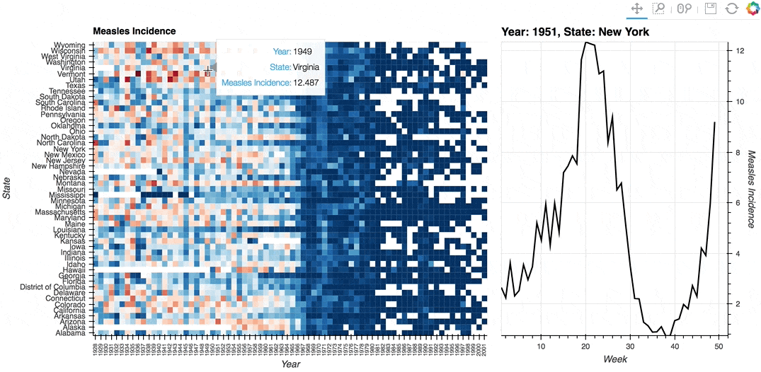
Description: A linked streams example demonstrating how use Tap stream on a HeatMap. The data contains the incidence of measles across US states by year and week (obtained from Project Tycho). The HeatMap represents the mean measles incidence per year. On tap the Histogram on the right will generate a Histogram of the incidences for each week in the selected year and state.
Dependencies: Bokeh
Backends: Bokeh
In [1]:
import pandas as pd
import numpy as np
import holoviews as hv
from holoviews import opts

hv.extension('bokeh', width=90)


In [2]:
# Declare dataset
df = pd.read_csv('http://assets.holoviews.org/data/diseases.csv.gz', compression='gzip')
dataset = hv.Dataset(df, vdims=('measles','Measles Incidence'))

# Declare HeatMap
heatmap = hv.HeatMap(dataset.aggregate(['Year', 'State'], np.mean),
                     label='Measles Incidence').select(Year=(1928, 2002))

# Declare Tap stream with heatmap as source and initial values
posxy = hv.streams.Tap(source=heatmap, x=1951, y='New York')

# Define function to compute histogram based on tap location
def tap_histogram(x, y):
    return hv.Curve(dataset.select(State=y, Year=int(x)), kdims='Week',
                   label='Year: %s, State: %s' % (x, y))

tap_dmap = hv.DynamicMap(tap_histogram, streams=[posxy])

(heatmap + tap_dmap).opts(
    opts.Curve(framewise=True, height=500, line_color='black', width=375, yaxis='right'),
    opts.HeatMap(cmap='RdBu_r', fontsize={'xticks': '6pt'}, height=500,
                 logz=True, tools=['hover'], width=700, xrotation=90)
)
Out[2]:
Download this notebook from GitHub (right-click to download).